
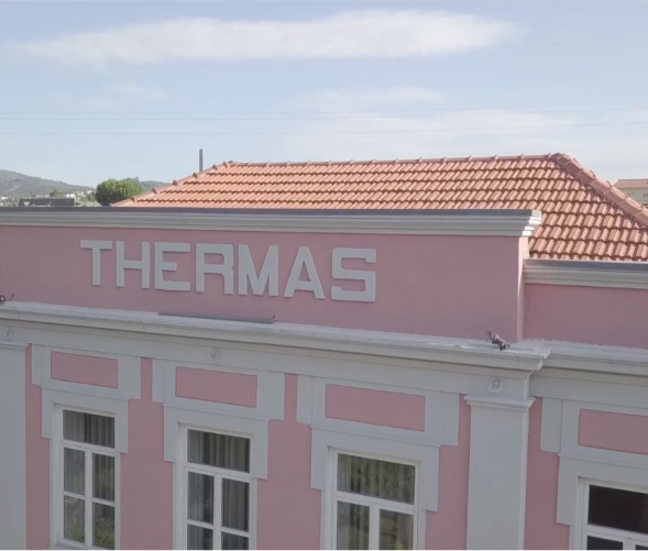
"Taipas Termal" brand
The Taipas Termal brand was created in 2011 as a way to modernize the Cooperative's institutional image. In September 2015, a new image was presented, with the conception and development of the new graphic identity by the White Studio office. The brand renewal aims to improve Taipas Termal's communication through visual coherence across all its materials and, in this way, promote the value of diversity and credibility of all its initiatives to the public through a common language.
THE SYMBOL/BRAND
The new symbol reflects Taipas Termal's positioning, looking to the future without forgetting its past.
The spirit of the letter T expresses the legacy of the thermal baths, represented in a sober and serious way, complemented by a sense of peace and well-being, conveyed through the soft tones present in the brand.
Features of the architecture and history of the space are also present, namely the copper lines that simulate water pipes made of the same material, which have been preserved over time. This is one of the main threads that constitute the identity of Taipas Termal.